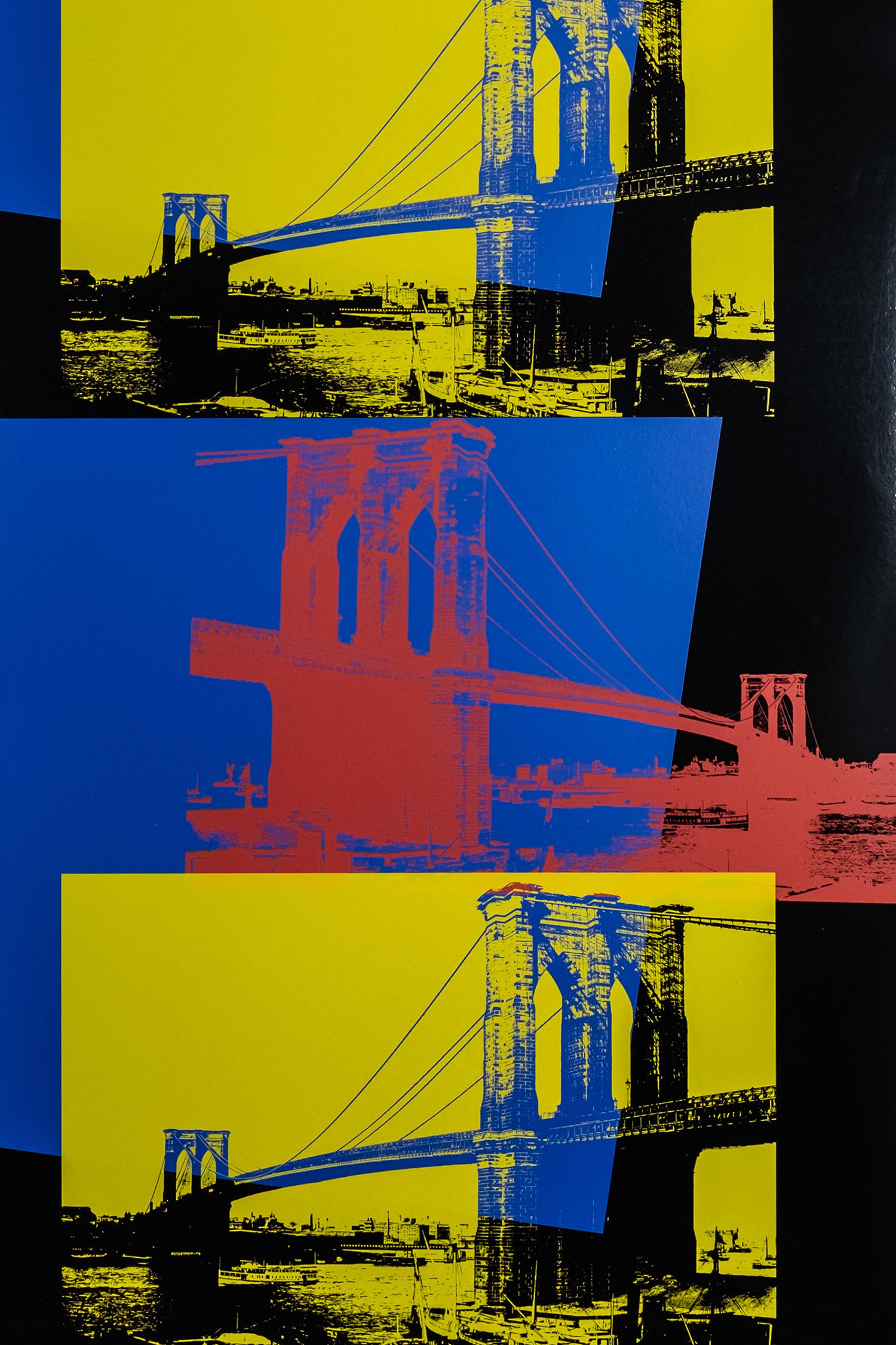
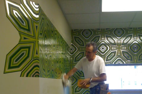
Warhol Brooklyn Bridge
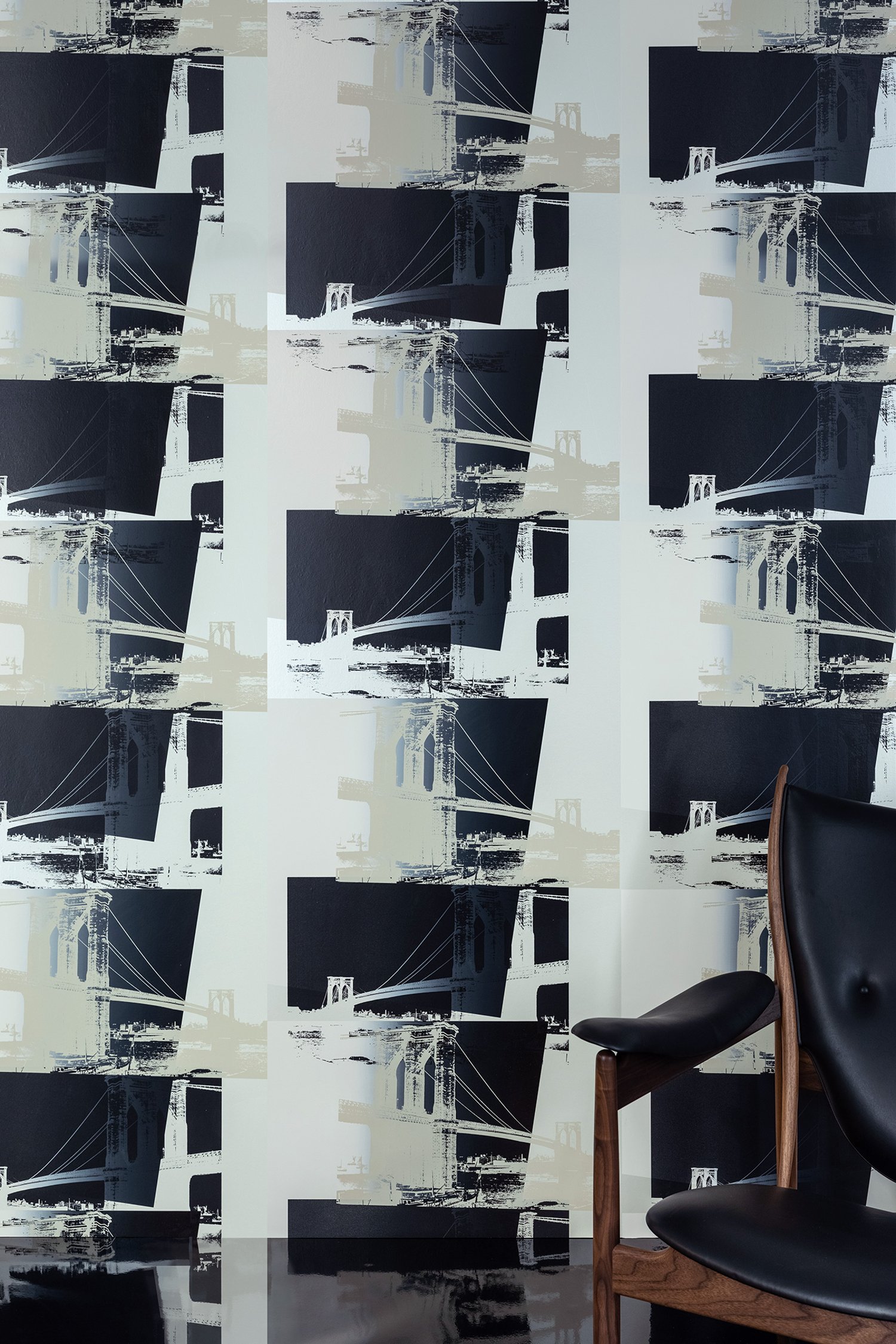
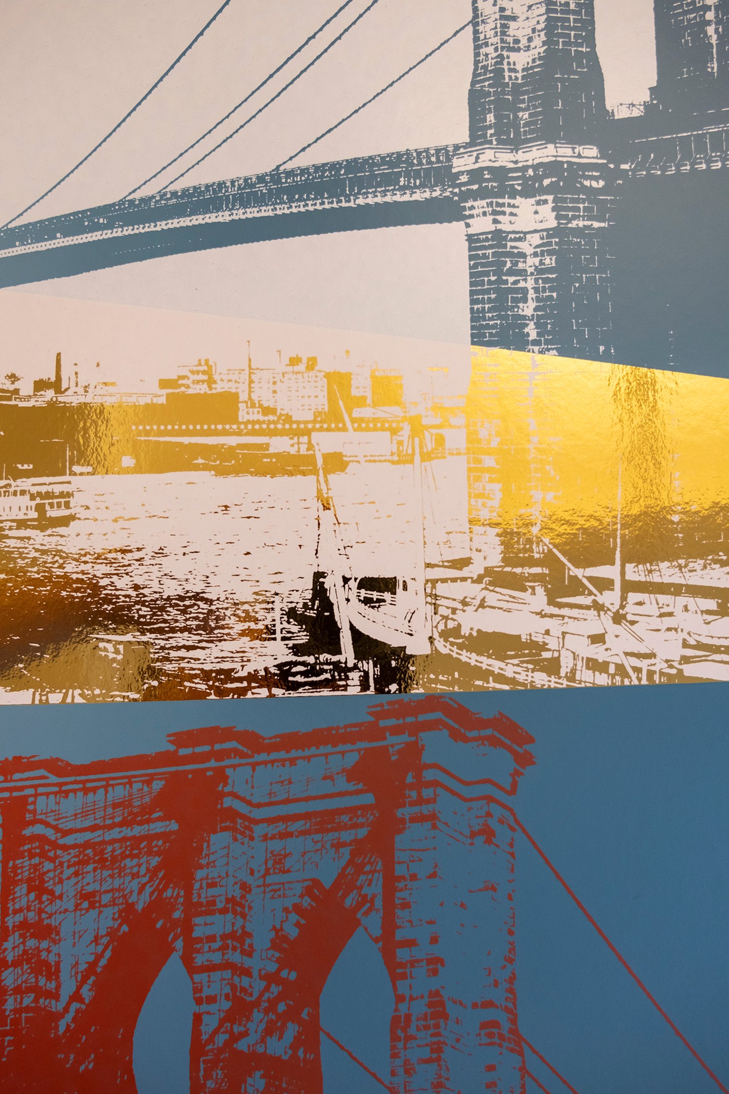
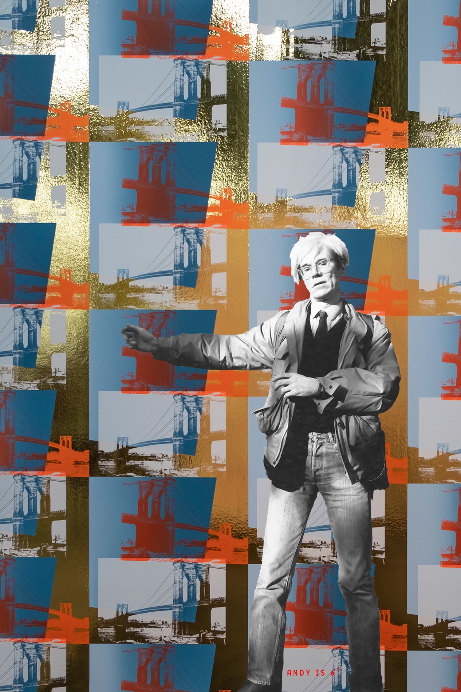
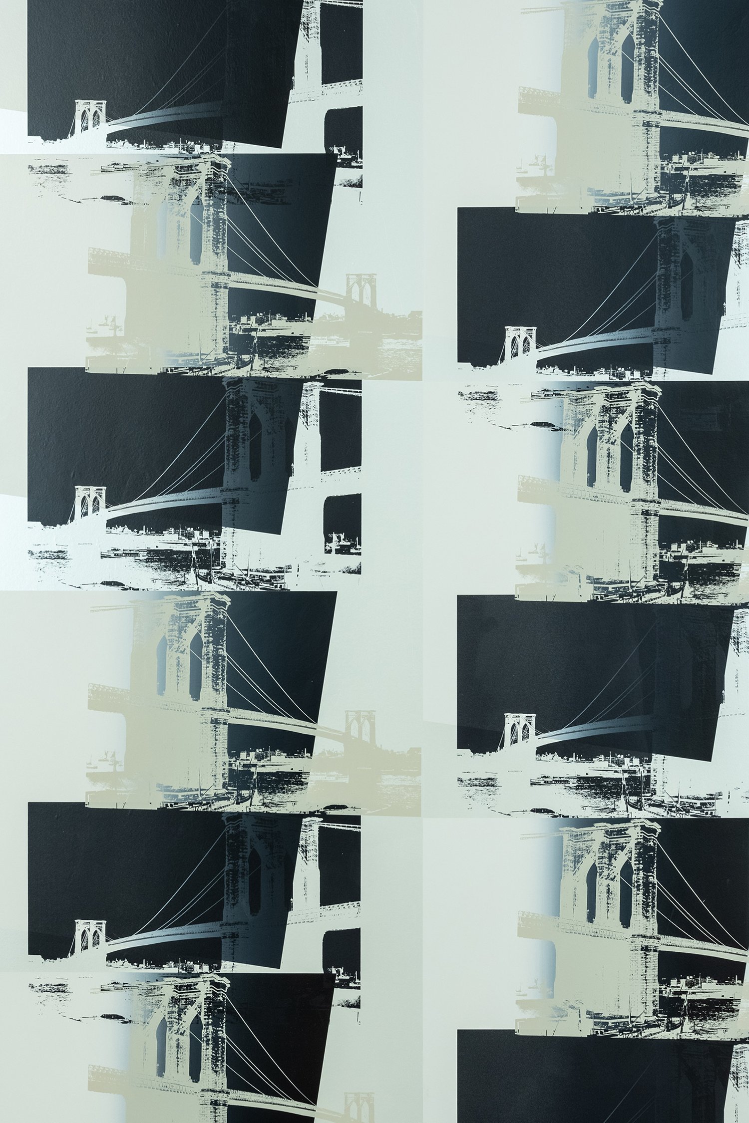
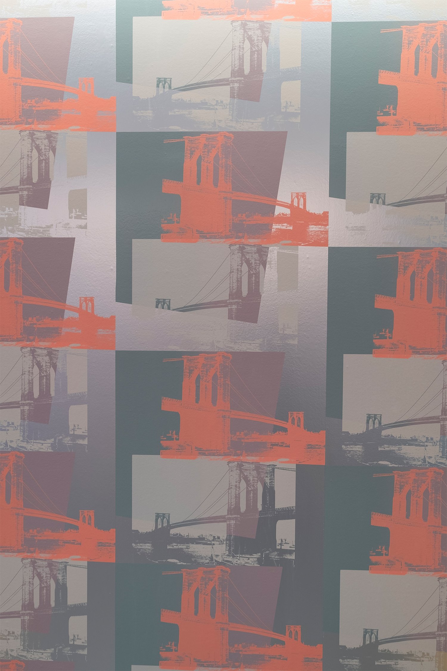
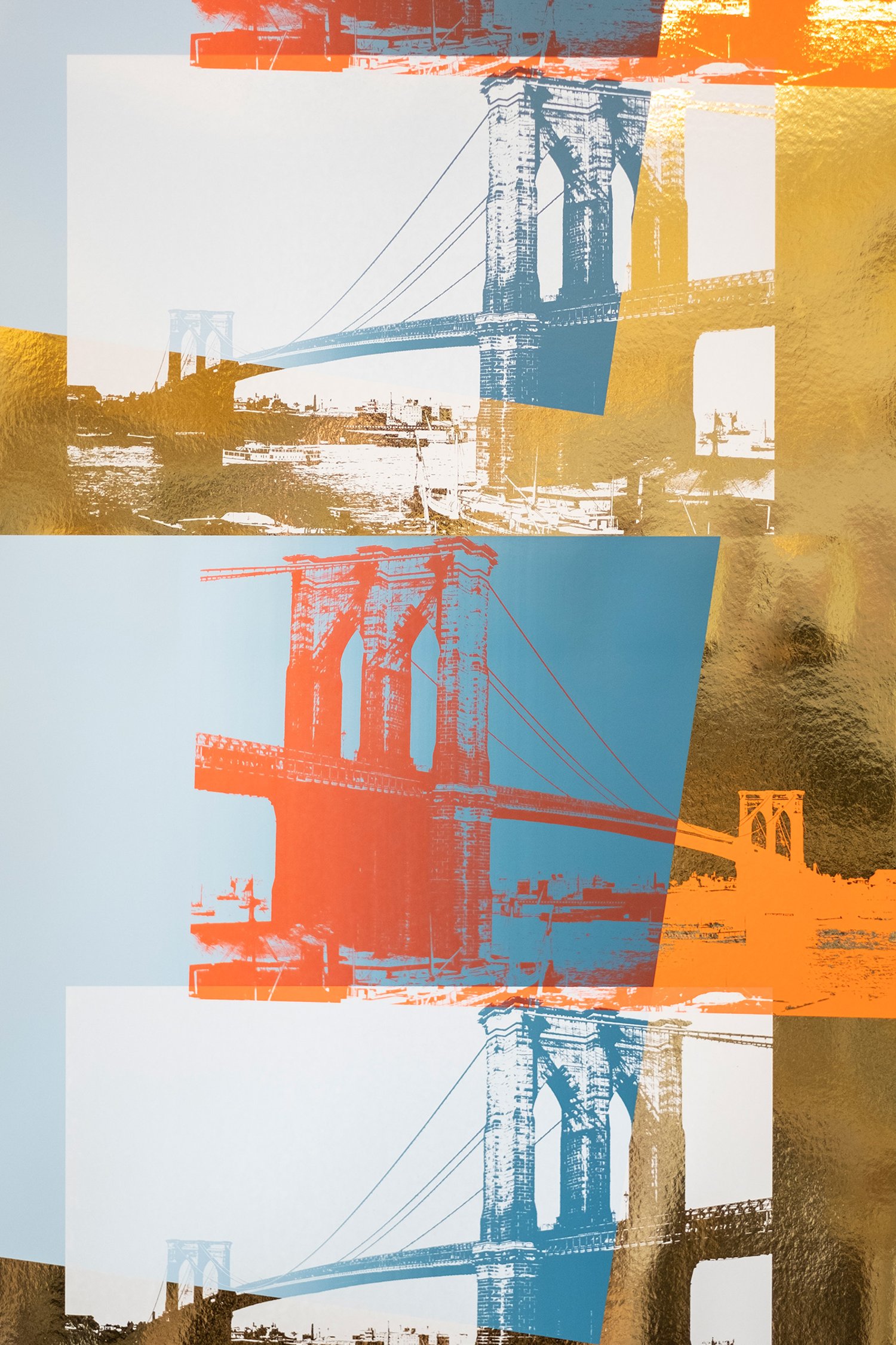
No Sleep Till Brooklyn was the anthem while creating this design as doing Warhol and our hometown proud was of paramount importance before we put this wallpaper to bed. In homage to the iconic work Warhol created in 1983 for the Brooklyn Centennial Commission to celebrate the Brooklyn Bridge’s 100th anniversary, this multi-color screenprint demonstrates his signature color-block technique as well as multi-layer runs of the subject to create a three-dimensional aesthetic. Like the man himself, Flavor Paper used a photo based printing process where an image of the bridge was exposed in a darkroom to the screen itself. And to bring it to life, our artists layered classic (and complementary) Warhol colors and utilized some flavorful materials to capture the opposing viewpoints by dividing the picture plane into a top and bottom half, creating two landscape compositions in one dynamic piece.
“Black is my favorite color and white is my favorite color.”
See it in action!
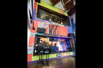
Brooklyn, NY
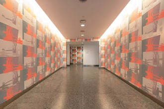
Brooklyn, NY
